


Fleet Farm
Overview:
During my time at Fleet Farm, I have had the opportunity to work on a diverse range of design projects that reflect the Brand's values. From marketing collateral to promotional campaigns, my work has spanned various mediums and objectives, all aimed at enhancing Fleet Farm's brand presence and customer engagement.
Scope of Work:
-
Marketing Campaigns: Designed visually compelling and effective print and digital marketing materials, including flyers, brochures, and social media graphics, that resonate with Fleet Farm’s customer base.
-
Branding: Ensured consistent application of Fleet Farm’s brand standards across all projects, from in-store signage to external communications.
-
Product Promotions: Developed creative concepts for seasonal promotions and sales events, focusing on clear messaging and strong calls-to-action to drive customer traffic and sales.
-
Employee Engagement: Designed internal communications and materials that reflect the company culture and foster employee connection, such as employee spotlights and event promotions.
-
Community Initiatives: Contributed to Fleet Farm’s community-focused projects, creating materials for events and partnerships that highlight the company’s commitment to local involvement.
-
Photography: Executed in-house product photography in the studio, delivering high-quality images for digital, print, and promotional use while maintaining brand consistency and attention to detail.
Key Achievements:
-
Successfully delivered multiple high-impact projects under tight deadlines, contributing to the success of key sales events and promotional campaigns.
-
Collaborated with cross-functional teams, including marketing, sales, and other out of company teams, to ensure designs aligned with overall business goals and brand guidelines.
-
Enhanced Fleet Farm's visual identity through consistent, high-quality design that reinforced brand trust and recognition among customers.
Design Tools:
-
Adobe Creative Suite: Utilized Adobe Illustrator, Photoshop, InDesign, and many other softwares to create professional-grade designs.
-
Project Management: Worked tirelessly to meet deadlines & ensure all deliverables were on brand & on target.
Impact:
My work at Fleet Farm has helped to elevate the company's visual communication across various channels, driving customer engagement, brand loyalty, and sales growth. I’ve had the privilege of contributing to Fleet Farm’s enduring presence in the community and retail landscape through thoughtful, strategic design.
Click on each project to learn more.
 |
|---|
 |
 |
 |
 |
|---|
 |
 |
|---|
 |
 |
|---|
 |
 |
 |
|---|
 |
 |
|---|
 |
 |
 |
|---|
 |
 |
|---|
 |
 |
 |
 |
|---|
 |
 |
|---|
 |
Iron Duck Restaurant Wine Label
Project Brief:
Commissioned by Iron Duck Restaurant to design a distinctive wine label that reflects their modern and minimalist aesthetic.
Objective:
Develop a sleek and contemporary wine label incorporating a white background, the restaurant’s logo, and elements specific to the wine's varietal (Auxerrois) and origin (Luxembourg).
Design Approach:
-
Conceptualization: Crafted a modern and minimalistic design that aligns with the Iron Duck Restaurant’s brand identity. Focused on creating a clean, elegant label that highlights the wine's unique qualities while maintaining visual simplicity.
-
Design Execution: Utilized Adobe Illustrator for precise vector design work, ensuring high-quality, scalable graphics. Incorporated the restaurant’s logo seamlessly into the label to reinforce brand recognition.
-
Illustration: Created the "Dapper Duck" illustration in Procreate, adding a unique and charming element that complements the wine’s sophisticated profile. The illustration was designed to be both eye-catching and reflective of the restaurant’s playful yet refined character.
-
Final Product: Delivered a polished, professional label that enhances the wine’s appeal and aligns with the restaurant’s modern branding. The design balances minimalism with strategic visual elements to create an engaging and memorable product.
This project provided an opportunity to blend graphic design with creative illustration, resulting in a wine label that stands out in both style and substance.


Greater Green Bay Chamber
During my internship at the Greater Green Bay Chamber, I contributed to a range of design and branding projects aimed at enhancing the Chamber’s visual communication and member engagement.
My role involved:
-
Graphic Design: Created visually compelling graphics for various marketing materials, including brochures, flyers, social media posts, and event banners. Utilized Adobe Creative Suite (Photoshop, Illustrator, InDesign) to produce designs that aligned with the Chamber’s brand guidelines.
-
Brand Development: Assisted in refining the Chamber’s brand identity through the development of cohesive visual elements. Helped in designing new templates and assets that strengthened the Chamber’s brand presence across multiple platforms.
-
Marketing Support: Collaborated with the marketing team to design promotional materials for Chamber events, member programs, and community outreach initiatives. Designed event flyers, digital ads, and newsletters to drive engagement and participation.
-
Project Management: Managed multiple design projects simultaneously, ensuring timely delivery and adherence to project requirements. Participated in brainstorming sessions and provided creative input for new initiatives.
-
Feedback Integration: Worked closely with team members and stakeholders to gather feedback and make iterative design improvements. Ensured that final designs met the Chamber’s needs and effectively communicated their message.
Through this internship, I gained hands-on experience in a professional design environment, developed a deeper understanding of branding and marketing strategies, and enhanced my ability to deliver high-quality design solutions under tight deadlines.
 |  |
|---|
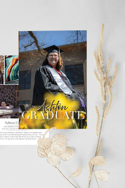
Cards
A variety of card designs from invitations to holiday cards and Costume Contest Ballots.
Roles and Responsibilities:
-
Graphic Design: I designed the cards using Illustrator, InDesign and Procreate to show elegant typography, a harmonious color palette, and creative layout elements that work well as a entire design.
-
Photography: I conducted a photoshoot to capture the graduation portraits that were both professional and personal which were then edited and cataloged in Lightroom.
 |  |  |
|---|---|---|
 |  |
Travel Wisconsin Brochure
Overview:
This project is a brochure designed to highlight the beauty of Wisconsin across all four seasons. It caters to Wisconsin travelers of all ages and serves as an informative guide about the state’s scenic attractions.
Design Process:
Information Gathering:
Information was collected from personal experiences as well as the Travel Wisconsin website, with specific details for each season.
Tools Used:
-
Adobe Illustrator: Designed and created the brochure, including all die cuts and special features.
-
Adobe Lightroom Classic: Edited and cataloged all images used in the brochure.
Photography:
All the photographs featured in the brochure were taken by the designer.
Accolades:
Award: Won 1st place in the 2023 Digital Arts Festival Design Category at NWTC.
(Note: Not affiliated with the official Travel Wisconsin brand.)
Visual Elements:
-
The brochure features a clean and modern design, with die-cut elements to add a unique touch.
-
The color scheme reflects the different seasons in Wisconsin, emphasizing the natural beauty of the state.
-
Photographs play a central role, with high-quality images that capture the essence of Wisconsin’s landscapes.
Key Components:
-
Cover: A vibrant and inviting cover featuring images representing Wisconsin, with the year 2023 prominently displayed.
-
Interior Pages: The interior pages offer detailed information about Wisconsin in each season, accompanied by photographs and engaging layouts.
-
Special Features: Unique die cuts are used in the design to add depth and interactivity.
Project Outcome:
The brochure effectively showcases Wisconsin’s beauty and won recognition for its innovative design and attention to detail. It is both functional and visually appealing, providing a memorable experience for the reader.
 |  |  |
|---|---|---|
 |  |  |
 |  |  |
 |  |  |
Chip Kidd Designer Booklet
Project Overview: Design an informative booklet about renowned graphic designer as part of a college assignment. The booklet aimed to provide a comprehensive overview of said designer's influential work and contributions to graphic design.
Objective: Create a visually engaging and informative booklet that highlights Chip Kidd’s career, notable projects, and design philosophy. The design needed to reflect Kidd’s distinctive style while presenting the content in a clear and engaging manner.
Design Approach:
-
Research & Content Development: Conducted thorough research on Chip Kidd’s biography, key projects, and design impact. Curated content to include a detailed profile, examples of his iconic book covers, and insights into his design process.
-
Design Concept: Developed a design concept that captures the essence of Chip Kidd’s dynamic and innovative approach to graphic design. Focused on incorporating elements that reflect his style, such as bold typography, vibrant colors, and creative layouts.
-
Visual Execution: Utilized Adobe InDesign to layout the booklet, ensuring a balance between text and visuals. Employed a clean, modern design with striking graphics and typography to echo Kidd’s influential work. Incorporated high-quality images of Kidd’s book covers and design projects to provide visual context.
-
Typography & Layout: Selected typography and layout techniques that align with Kidd’s aesthetic, including bold headlines and playful yet professional formatting. Ensured that the booklet was both visually appealing and easy to navigate.
-
Final Presentation: Produced a polished, professional booklet that offers an in-depth look at Chip Kidd’s contributions to graphic design. The design effectively communicates his impact and showcases his work in a visually compelling format.
This project allowed me to explore and represent the work of a leading graphic designer while applying design principles to create an informative and visually engaging publication.
 |  |  |
|---|---|---|
 |  |